Composition is “the act of combining parts or elements to form a whole.” When it comes to photography it is an integral part of any photograph. The difference between a good photo and an amazing photo is all in the way you compose the image. You can take two photos with identical subject matter and lighting but the one with the best composition will always be more appealing to the masses. With BMX photography specifically it helps to pay close attention to the entire photo as opposed to simply worrying about the rider themselves. There is much more of a story to be told with each and every photo if shot correctly. Lets break it down and find out more about what it takes to compose a shot that will stand out from the rest.
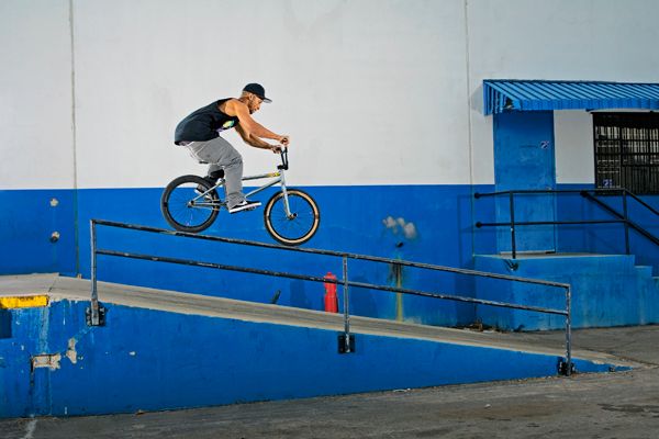
Always do your best to tell the full story. What I mean by telling the story is simply showing the entire scene in a single photo. This is especially important when it comes to BMX photos. You want to let the viewer know exactly what is going on from start to finish. Make sure to include where the rider is coming from and where they are going every time you shoot. Sometimes it won’t be as obvious as others and in those cases you will just have to try your best. Your goal as a photographer should be to have a solid composition within each shot. There is never a right or wrong way to shoot a photo but once you get the feel for a good composition you will look at the world a little differently. This photo of Chris Brown is a good example of “telling the story” and it’s pretty easy to see that he came from the left of the frame; tire rode the rail, and then landed to the right of the frame. The entire obstacle is in the photo and the way it is shot from the side shows the true length of the rail. I also wanted to shoot him pretty much as soon as he landed on the rail to show that he rode as much of it as he possibly could.
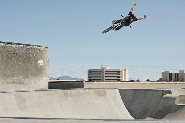
Use the rule of thirds. The rule of thirds is “The guideline which proposes that an image should be imagined as divided into nine equal parts by two equally-spaced horizontal lines and two equally-spaced vertical lines, and that important compositional elements should be placed along these lines or their intersections.” There is a reason that it has the word “guidleine” in the definition and that is simply all that it is; a sort of starting point for your photo. In this shot of Mike Payne it is obvious that Mike is not in the center of the photo but off to the right, and in the top corner. He is the compositional element in this case and was placed along the intersection of the vertical and horizontal lines. The wallride/sub box in the left of the photo helps to balance things out a little bit and not feel so heavily weighted on the right side. When you see a photo with a striking composition you can bet that the photographer more than likely planned it that way. Sure, anyone can get lucky and come up with a good composition but it takes skill and an “eye” for photography to do it over and over again intentionally.
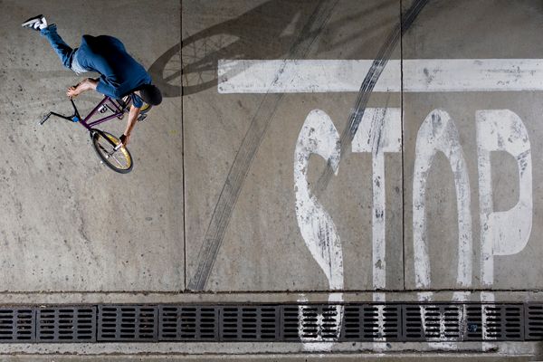
Look for unique angles and don’t be afraid to make a bad decision. There have been many times where I was set up to shoot a photo and completely changed the angle where I was shooting from after the rider gives it a few goes. There is nothing wrong with that as long as the rider is willing to give the trick a few more tries and in most cases, the more you search for the perfect angle, the better off you will be. You never want to look at a photo and automatically regret not shooting it from a different angle that you think might have looked better. Don’t leave that to question. Check all of your angles first and find the one that compliments the photo the best. This photo of Ahmed Johnson has been one of my favorites for a while now simply because of the composition and unique viewpoint. Mess around with angles from above, from far away, from the front, back, side or whatever just be creative and confident that the angle you are choosing is the best one.
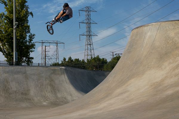
Intentionally make things happen. In this photo of Larry Alvarado I noticed that when we first started shooting the original angle I had picked placed Larry right in front of the power lines making for a really distracting photo. It was taking away from the subject and that is never a good thing. I simply moved around a bit and ended up noticing that with the way Larry was dipping the toboggan he created this diagonal line that matched up almost perfectly with some of the wires going from one tower to the other. Now surely, this could have happened on accident had I been shooting a ton of photos of the same trick over and over but that was not the case. These are the little things I mentioned that could make all of the difference. Would it have been the end of the world if I kept the photo of Larry in front of the tower and called it a day? Probably not but in my honest opinion it looks way cleaner, and more well thought out the way it is.
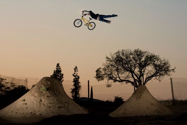
Don’t be afraid of symmetry and centering your subject. Nearly every photographer you talk to will always mention the “rule of thirds” and recommend never shooting dead center but there are plenty of exceptions that can work as long as you have a reason for doing so. I intentionally shot this photo of Luke Parslow with him in the center of the frame because the lip and landing do a good job of balancing the photo out and the way it is shot from the side really helps to show the size of the jump and put it into perspective how high he actually is.
When it comes right down to it, the best advice I can give is to find out what works for you as a photographer. Don’t get too caught up in the rules; don’t get too caught up in the “right” or “wrong” way to shoot. That is the appeal of photography. There is no right or wrong way. As long as you are happy with the images you create that is all that matters. Sure, there are fundamental aspects of photography that every serious shooter should know but don’t be afraid to push the boundaries a little bit. The best thing you can do is make mistakes. As long as you learn from them and understand what you need to do to make your next image better that is all that matters. Also keep in mind that this column is entirely based around helping you become a better photographer and that is all. Just like the rule of thirds is “guideline” I hope that you see each TTL feature as a way to help you think a little differently when it comes to your own personal work. Be sure to check back next Wednesday for the thirteenth edition of Through the Lens and as always feel free to leave any questions in the comments section or email me at info@jeremypavia.com and I will hit you back as soon as I can. Also, feel free to follow me on Twitter and Instagram @jeremypavia.
Don’t forget to “LIKE” The Union on Facebook – Facebook.com/BMXunion and follow us on Twitter @BMX_UNION
Past Through The Lens:
How To Creat Seamless Sequences in Photoshop
5 Things Every BMX Photographer Should Know
The Fisheye Lens
Shooting Etiquette: Some Do’s and Don’t’s
Networking – Why and How
The Process: Pool Riding
What Kind of DSLR Should I Get?
The Road To Getting Published
Shooting with Available Light
Gear Check
Why BMX Photography?